Building reports in Microsoft Fabric
In this section of the tutorial, you create a Power BI data model and create a report from scratch.
Power BI is natively integrated into the whole Fabric experience. This native integration brings a unique mode, called DirectLake, of accessing the data from the lakehouse to provide the most performant query and reporting experience. DirectLake mode is a groundbreaking new engine capability to analyze very large datasets in Power BI. The technology is based on the idea of loading parquet-formatted files directly from a data lake without having to query a data warehouse or lakehouse endpoint, and without having to import or duplicate data into a Power BI dataset. DirectLake is a fast path to load the data from the data lake straight into the Power BI engine, ready for analysis.
In traditional DirectQuery mode, the Power BI engine directly queries the data from the source to execute each query, and the query performance depends on data retrieval speed. DirectQuery eliminates the need to copy data, ensuring that any changes in the source are immediately reflected in the query results during the import. On the other hand, in Import mode, performance is better because the data is readily available in the memory without querying data from the source for each query execution. However, the Power BI engine must first copy the data into memory during data refresh. Only changes to the underlying data source are picked up during the next data refresh(in scheduled as well as on-demand refresh).
DirectLake mode now eliminates this import requirement by loading the data files directly into memory. Because there's no explicit import process, it's possible to pick up any changes at the source as they occur, thus combining the advantages of DirectQuery and import mode while avoiding their disadvantages. DirectLake mode is therefore the ideal choice for analyzing very large datasets and datasets with frequent updates at the source.
Microsoft Fabric Labs
- Azure Microsoft Fabric - Lab -1 for Beginners:
- Azure Microsoft Fabric - Auto Power BI Reports Lab -2:
- Microsoft Fabric - Ingest data into the Lakehouse Lab - 3:
- Microsoft Fabric - Lakehouse and Data Transformation - Lab - 4:
- Microsoft Fabric and Power BI Reports Lab - 5:
- Microsoft Fabric - Resource Cleanup in Lab -6
Task 1: Explore data in the silver layer using the SQL endpoint
- From your left navigation pane, select Fabric_LakehouseXX and then select wwilakehouse of Type SQL endpoint.
- From the SQL endpoint pane, you should be able to see all the tables you created. If you don't see them yet, select the Refresh icon at the top. Next, select the Model tab at the bottom to open the default Power BI dataset.


- For this data model, you need to define the relationship between different tables so that you can create reports and visualizations based on data coming across different tables.
- From the fact_sale table, drag the CityKey field and drop it on the CityKey field in the dimension_city table to create a relationship. The Create Relationship dialog box appears.

In the Create Relationship dialog box:
- Table 1 is populated with fact_sale and the column of CityKey.
- Table 2 is populated with dimension_city and the column of CityKey.
- Cardinality: Many to one (*:1)
- Cross filter direction: Single
- Leave the box next to Make this relationship active selected.
- Select the box next to Assume referential integrity.
- Select Confirm.

- Now, add these relationships with the same Create Relationship settings as shown above but with the following tables and columns:
- StockItemKey(fact_sale) - StockItemKey(dimension_stock_item)
- Salespersonkey(fact_sale) - EmployeeKey(dimension_employee)
- CustomerKey(fact_sale) - CustomerKey(dimension_customer)
- InvoiceDateKey(fact_sale) - Date(dimension_date)
- After you add these relationships, your data model should be as shown in the below image and it will be ready for reporting.

Task 2: Build Report
- From the top ribbon, select New Report to start creating reports/dashboards in Power BI.

- On the Power BI report canvas, you can create reports to meet your business requirements by dragging the required columns from the Data pane to the canvas and using one or more of the available visualizations.
- Add a title:
- In the Ribbon, select Text box. Type in WW Importers Profit Reporting. Highlight the text and increase the size to 20.
- Resize the text box place it in the upper left of the report page and click outside the textbox.
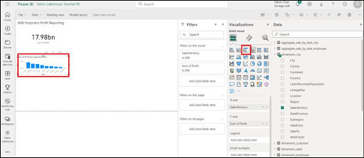
- Add a Card:
- On the Data pane, expand fact_sales and check the box next to Profit. This selection creates a column chart and adds the field to the Y-axis.
- With the bar chart selected, select the Card visual in the visualization pane.
- This selection converts the visual to a card. Place the card under the title.
- Click anywhere on the blank canvas (or press the Esc key) so the Card that we just placed is no longer selected.
- Add a Bar chart:
- On the Data pane, expand fact_sales and check the box next to Profit. This selection creates a column chart and adds the field to the Y-axis.
- On the Data pane, expand dimension_city and check the box for SalesTerritory. This selection adds the field to the Y-axis.
- With the bar chart selected, select the Clustered bar chart visual in the visualization pane. This selection converts the column chart into a bar chart.
- Resize the Bar chart to fill in the area under the title and Card.
- Click anywhere on the blank canvas (or press the Esc key) so the bar chart is no longer selected.


Build a stacked area chart visual:
- On the Visualizations pane, select the Stacked area chart visual.
- Reposition and resize the stacked area chart to the right of the card and bar chart visuals created in the previous steps.
- On the Data pane, expand fact_sales and check the box next to Profit. Expand dimension_date and check the box next to FiscalMonthNumber. This selection creates a filled line chart showing profit by fiscal month.
- On the Data pane, expand dimension_stock_item and drag BuyingPackage into the Legend field well. This selection adds a line for each of the Buying Packages.
- Click anywhere on the blank canvas (or press the Esc key) so the stacked area chart is no longer selected.


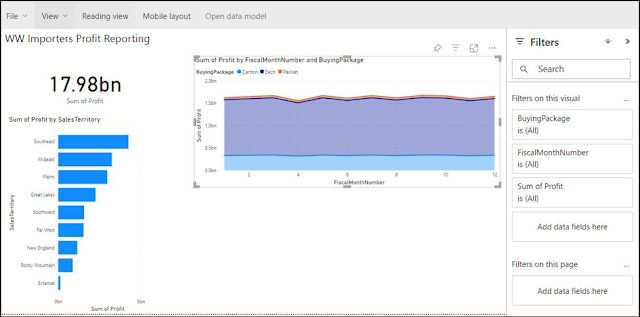
Build a column chart:
- On the Visualizations pane, select the Stacked column chart visual.
- On the Data pane, expand fact_sales and check the box next to Profit. This selection adds the field to the Y-axis.
- On the Data pane, expand dimension_employee and check the box next to Employee. This selection adds the field to the X-axis.
- Click anywhere on the blank canvas (or press the Esc key) so the chart is no longer selected.


- Microsoft Fabric - Resource Cleanup in Lab -6
No comments:
Post a Comment