Use Apache Spark in Azure Databricks
One of the benefits of Spark is support for a wide range of programming languages, including Java, Scala, Python, and SQL; making Spark a very flexible solution for data processing workloads including data cleansing and manipulation, statistical analysis and machine learning, and data analytics and visualization. Azure Databricks is built on Apache Spark and offers a highly scalable solution for data engineering and analysis tasks that involve working with data in files.
Step 1. Setup Azure Databricks Workspace and open notebook
Steps are available: https://saurabhsinhainblogs.blogspot.com/2024/01/azure-databricks-lab-how-to-start-with.html
- Connect to Azure Portal
- Setup Azure Datbricks
- Setup Cluster for Azure Databricks
- Open Notebook
Step 2. Prepare data to consume
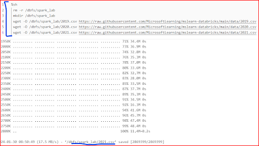
Shell commands can also use to download data files from GitHub into the Databricks file system (DBFS)
Code:
Step 3. Load the data frame and view the data
- Data doesn't include the column headers
- Information about the data types is missing
")
Step 3. Define a schema for the data frame
Observe that this time, our below problems are solved
- The data frame includes column headers
- Information about the data types is also available
Code:


Step 4. Filter a data frame
- Filter the columns of the sales orders data frame to include only the customer name and email address.
- When you perform an operation on a data frame, the result is a new data frame (in this case, a new customer data frame is created by selecting a specific subset of columns from the df data frame)
- The dataframe['Field1', 'Field2', ...] syntax is a shorthand way of defining a subset of column. You can also use select method, so the first line of the code above could be written as customers = df.select("CustomerName", "Email")
- Count the total number of order records
- Count the number of distinct customers
- Display the distinct customers
- Dataframes provide functions such as count and distinct that can be used to summarize and filter the data they contain.
Code:
) print(customers.distinct().count()) display(customers.distinct())")
.where(df['Item']=='Road-250 Red, 52') print(customers.count()) print(customers.distinct().count()) display(customers.distinct())")
Step 5. Aggregate and group data in a data frame
Code:
.groupBy(\"Item\").sum() display(productSales)")
Show the number of sales orders per year. Note that the select method includes a SQL year function to extract the year component of the OrderDate field, and then an alias method is used to assign a column name to the extracted year value. The data is then grouped by the derived Year column and the count of rows in each group is calculated before finally the orderBy method is used to sort the resulting dataframe.
Code:
.alias(\"Year\")).groupBy(\"Year\").count().orderBy(\"Year\") display(yearlySales)")
Step 6. Query data using Spark SQL
- The native methods of the data frame object you used previously enable you to query and analyze data quite effectively. However, many data analysts are more comfortable working with SQL syntax.
- Spark SQL is a SQL language API in Spark that you can use to run SQL statements, or even persist data in relational tables.
- The code you just ran creates a relational view of the data in a data frame, and then uses the spark.sql library to embed Spark SQL syntax within your Python code query the view and return the results as a data frame.
Code:
 spark_df = spark.sql(\"SELECT * FROM salesorders\") display(spark_df)")
- The ``%sql` line at the beginning of the cell (called a magic) indicates that the Spark SQL language runtime should be used to run the code in this cell instead of PySpark.
- The SQL code references the salesorder view that you created previously.
- The output from the SQL query is automatically displayed as the result under the cell.
 AS OrderYear, SUM((UnitPrice * Quantity) + Tax) AS GrossRevenue FROM salesorders GROUP BY YEAR(OrderDate) ORDER BY OrderYear;")
Step 7. Visualize data with Spark
- Azure Databricks include support for visualizing data from a data frame or Spark SQL query.
- It is not designed for comprehensive charting.
- You can use Python graphics libraries like Matplotlib and Seaborn to create charts from data in data frames.
- Visualization type: Bar
- X Column: Item
- Y Column: Add a new column and select Quantity. Apply the Sum aggregation.
- Save the visualization and then re-run the code cell to view the resulting chart in the notebook.

Step 8. Use Matplotlib in Databricks

- The matplotlib library requires a Pandas dataframe, so you need to convert the Spark dataframe returned by the Spark SQL query to this format.
- At the core of the matplotlib library is the pyplot object. This is the foundation for most plotting functionality.
 # Create a bar plot of revenue by year plt.bar(x=df_sales['OrderYear'], height=df_sales['GrossRevenue']) # Display the plot plt.show()")
 # Customize the chart plt.title('Revenue by Year') plt.xlabel('Year') plt.ylabel('Revenue') plt.grid(color='#95a5a6', linestyle='--', linewidth=2, axis='y', alpha=0.7) plt.xticks(rotation=45)")
Code:
) # Create a bar plot of revenue by year plt.bar(x=df_sales['OrderYear'], height=df_sales['GrossRevenue'], color='orange') # Customize the chart plt.title('Revenue by Year') plt.xlabel('Year') plt.ylabel('Revenue') plt.grid(color='#95a5a6', linestyle='--', linewidth=2, axis='y', alpha=0.7) plt.xticks(rotation=45) # Show the figure")
A figure can contain multiple subplots, each on its own axis
Code:
 # Create a figure for 2 subplots (1 row, 2 columns) fig, ax = plt.subplots(1, 2, figsize = (10,4)) # Create a bar plot of revenue by year on the first axis ax[0].bar(x=df_sales['OrderYear'], height=df_sales['GrossRevenue'], color='orange') ax[0].set_title('Revenue by Year') # Create a pie chart of yearly order counts on the second axis yearly_counts = df_sales['OrderYear'].value_counts() ax[1].pie(yearly_counts) ax[1].set_title('Orders per Year') ax[1].legend(yearly_counts.keys().tolist()) # Add a title to the Figure fig.suptitle('Sales Data') # Show the figure")
Step 9. Use the Seaborn Library
Using the seaborn library (which is built on matplotlib and abstracts some of its complexity) to create a chart:
Code:
 # Clear the plot area # Create a bar chart ax = sns.barplot(x=\"OrderYear\", y=\"GrossRevenue\", data=df_sales) plt.show()")
Seaborn library makes it simpler to create complex plots of statistical data, and enables you to control the visual theme for consistent data visualizations.
Code:
 # Clear the plot area # Set the visual theme for seaborn sns.set_theme(style=\"whitegrid\") # Create a bar chart ax = sns.barplot(x=\"OrderYear\", y=\"GrossRevenue\", data=df_sales) plt.show()")
Like matplotlib. seaborn supports multiple chart types
Code:
 # Clear the plot area # Create a bar chart ax = sns.lineplot(x=\"OrderYear\", y=\"GrossRevenue\", data=df_sales) plt.show()")
Step Last. Cleanup Resources
- In the Azure Databricks portal, on the Compute page, select your cluster and select ■ Terminate to shut it down.
- If you’ve finished exploring Azure Databricks, you can delete the resources you’ve created to avoid unnecessary Azure costs and free up capacity in your subscription.
ReplyDelete"Wow, this was actually helpful. That section on workflows vs. projects is a total game-changer—it’s the kind of practical stuff you usually only learn the hard way on the job. Honestly, it's one of the easiest good knowledge of apache-spark lifecycle guides I’ve come across. Keep it up!"
ReplyDeleteVery informative and well-explained tutorial.The apache-spark-tutorial concepts are easy to understand, and the examples are helpful for beginners.Great learning resource Learn apache-spark-tutorial.